Financial markets went on a fairly wild ride last week as downbeat manufacturing data combined…
What’s Up With Market Madness After Fed’s Rate Hike?
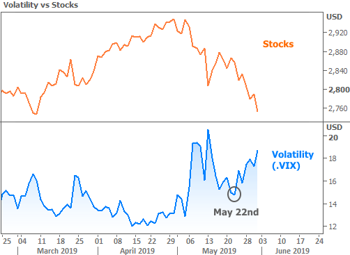
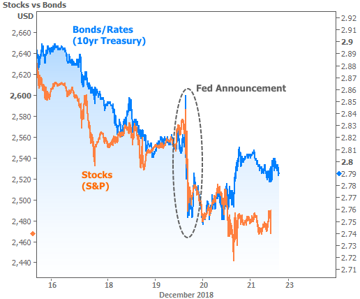
Last week we discussed the possibility of mortgage rates continuing to fall despite the near certainty of this week’s Fed rate hike. That’s exactly what happened, but it was the move in stocks that got the most attention–not a surprising result given the following chart.
While there has been plenty of news coverage of the potential government shutdown and Trump’s potential legal issues, markets were far more interested in the Federal Reserve’s policy announcement. It was clearly this week’s defining event for both stocks and bonds.
So what did the Fed say/do to bring about such a reaction? And were they justified?
First thing’s first: you won’t hear any bond traders asking whether or not the Fed was justified in hiking rates this week. The probability of this hike has been as close to 100% as it gets for several months. Not only was it a foregone conclusion, but it’s very hard to argue that the Fed should have reconsidered for any reason other than the heavy stock losses of late.
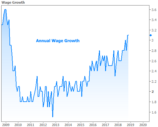
Unfortunately for stocks, the Fed is primarily concerned with employment and inflation. In that regard, the most recent update on the unemployment rate shows it at the lowest level since 1969. While no one sees inflation running to unmanageable levels, the Fed is keeping an eye on wage growth–a precursor to inflation. Here’s what that looks like:
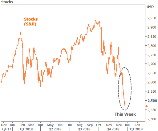
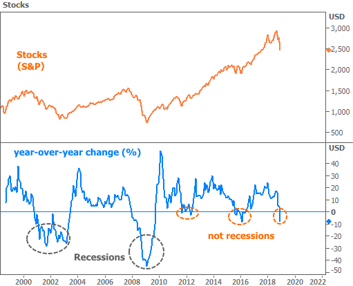
Granted, the stock market’s motivations are too complicated to pin on only one factor, but when it comes to the Fed, stocks are basically whining. Notably, the last time they whined like this was in early 2016, right after the Fed began hiking rates for the first time after 8 years of record lows.
It’s hard to see evidence of that “whining” simply by looking at stock prices, but if we look at the annual rate of change (blue line in the following chart), we see that the current losses are similar to those seen in 2016.
Because we’re still in the middle of a market move that could continue, we can’t rule out the possibility that stocks continue to fall. Conversely, because stocks have yet to show any recession-level panic, there’s just as much of a chance that they’ll find their footing. If that happens, it could be bad for interest rates.
Stocks and rates don’t always move in the same direction. Recently, however, stock losses have created buying demand in bonds, which are viewed as a safe haven for return-on-investment when stocks are losing ground (more bond buying = lower rates). Incidentally, the last time rates had 2 back-to-back months this good was early 2016 (the last time stocks were this panicked).
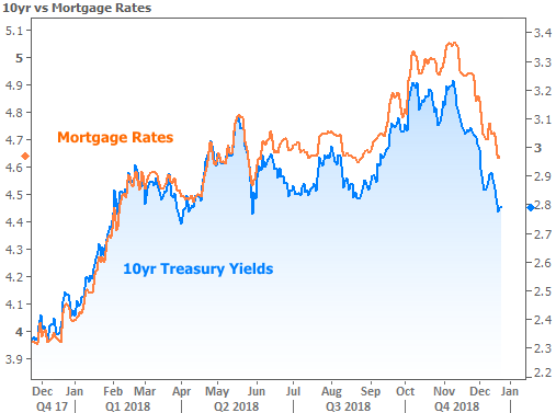
If rates end up bouncing higher, the silver lining is that mortgage rates don’t have as much to lose as US Treasuries. Treasuries are the benchmark for essentially every other interest rate in the US. Among the big asset classes, they’re the first to benefit from stock market panic–a fact that’s left mortgages out in the cold, relatively.
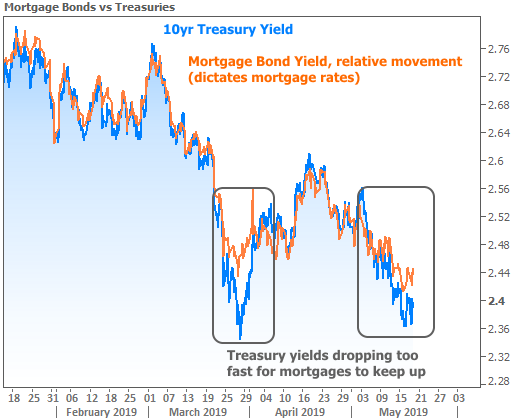
There are more complex ways to look at the relationship between mortgages and Treasuries. The green line in the following chart represents one of the methods. In not so many words, it compares the relative level of demand for mortgage bonds versus Treasuries among bond investors.
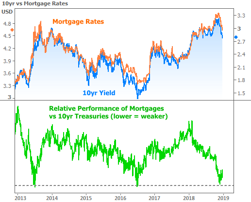
The chart above is actually good news for mortgage rates. The green line looks like it’s bouncing at the same floor seen in 2013 and 2016. This floor means that bond investors are seeing strong enough returns in mortgages to start buying more of them. This doesn’t guarantee lower rates in and of itself, but it does suggest mortgages would be better able to participate in good news and less affected by bad news.
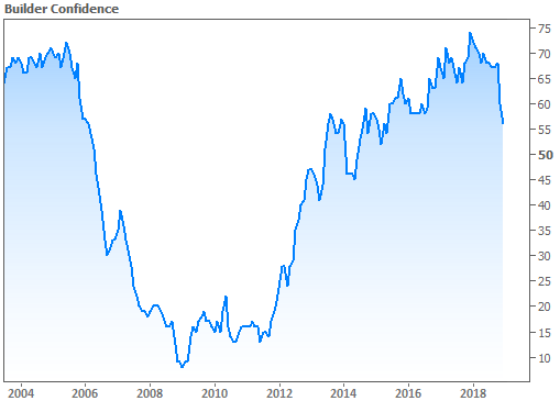
The housing market would certainly not object to good news for rates. Several of the key monthly housing reports were released this week, showing an interesting mix of panic and resilience. The most downbeat report was NAHB’s Housing Market Index (basically, home builder confidence).
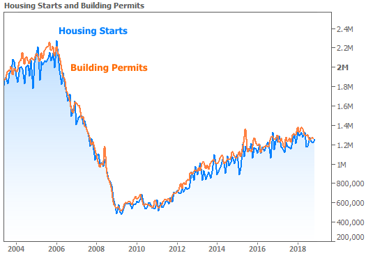
At the same time, actual construction numbers were conveying far less panic:
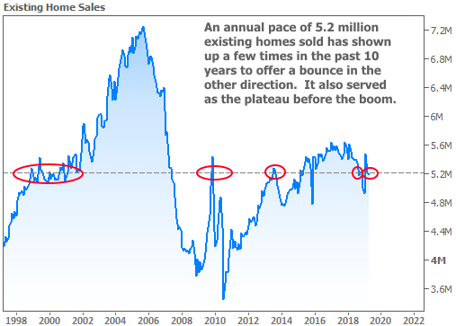
Existing Home Sales also had a better month in November, rising from an annual pace of 5.22 million units to 5.32 million. This defied analysts’ expectations for further softening.
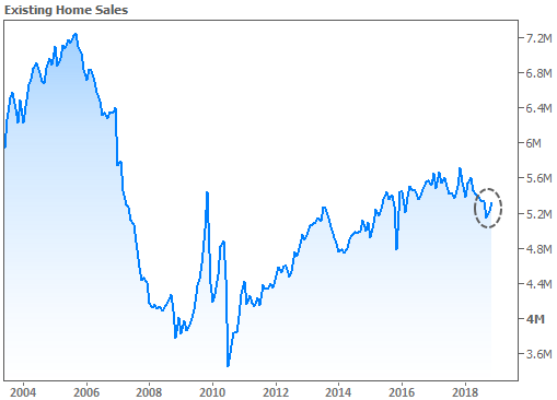
The most exciting thing about any housing market resilience seen in November is that the numbers have not yet had a chance to fully benefit from recently lower rates. That’s a feather in the cap for December and January’s numbers.
Next week brings the Christmas holiday. Bond markets will be closed on Tuesday and only in for a half day on Monday. Even in the 2nd half of the week, markets won’t really be operating normally. For that, we’ll have to wait until the end of the following week which brings the all-important jobs report on Friday, January 4th.
© 2018 MBS Live, Inc. 19701 Bethel Church Rd Suite 103-225 – Cornelius, NC 28031. All rights reserved.
Related Posts