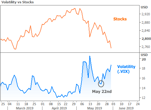
Financial markets went on a fairly wild ride last week as downbeat manufacturing data combined…
Housing Pops; Rates Drop
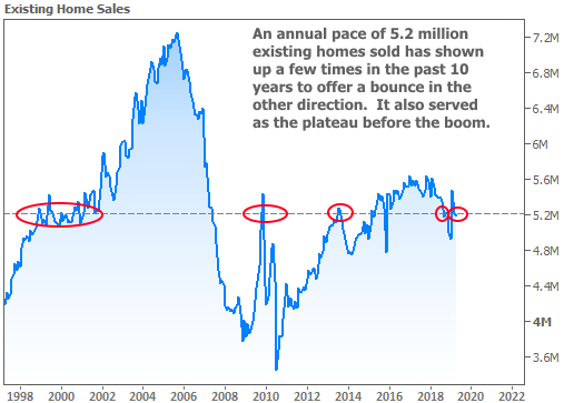
Things were starting to look pretty scary for housing up until a few weeks ago. There was a chance that some of the weakness was temporary. Last week’s strong Pending Home Sales report provided some hope, but we didn’t have any other big housing reports to validate the hope… until now.
New Home Sales were as low as 549k at the end of 2018. This was well below the post-crisis trend of improvement. A strong number at the end of January had to be taken with a grain of salt because it pertained to November’s sales, not to mention the fact that this data series is notoriously prone to revisions.
This week brought us December’s New Home Sales data, and while there was a negative revision to that strong November number, it fell into a nice line leading back to the previous trend as seen in the chart below. Granted, we’re just now back to the lower boundary of that growth trend, but things could definitely be worse.
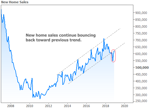
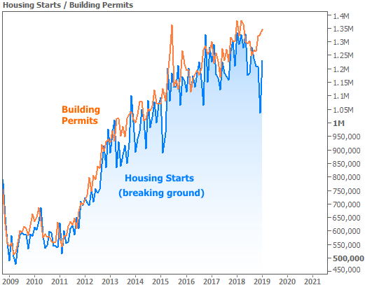
In a separate report from the Census Bureau, New Residential Construction showed a similar uptick for Building Permits and Housing Starts (which refers to the breaking of ground on new construction
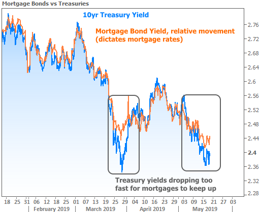
At least part of the equation for the housing slump and recovery has been interest rates. Unlike stocks, which have closed much of the gap to 2018 highs, rates remain near the lowest levels in more than a year. Part of the reason for this is a softening in economic data. A strong economy can support higher rates, so economic weakness tends to coincide with rates falling.
The Employment Situation (aka the “jobs report”) is the most important piece of economic data as far as interest rates are concerned. When it’s weaker than expected, rates tend to fall. Friday’s jobs report was incredibly weak! Rates clearly should have fallen in response. They did exactly that at first, but paradoxically bounced higher as the morning continued.
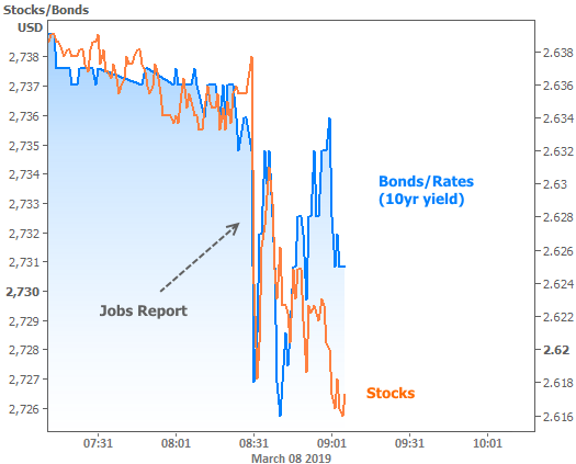
Stocks were included in the chart above to show the correlation that’s frequently seen surrounding surprising economic data. Logically, bad economic news could prompt investors to sell stocks and buy bonds (buying bonds = lower rates). So why did some investors start selling bonds (pushing the blue line higher) even though stocks continued to fall?
It’s a bit anticlimactic to consider, but rates may simply have had enough of a good thing for the week. Thank central banks for that!
Economic data may paint a picture and suggest a logical range for interest rates, but more often than not, it’s central bank policy changes that cause the bigger movements inside those ranges. Both the Fed and the ECB (European Central Bank) have been fairly friendly toward bonds/rates recently. This week, it was the ECB’s turn. Thursday’s ECB Announcement and press conference helped rates improve at their fastest pace of the week.
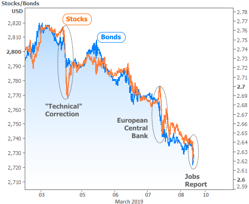
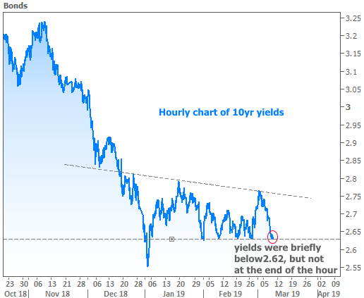
Notice the reference to a “technical correction” in the chart above. This refers to trading that disregards fundamental data/news/events and instead relies only on the chart patterns for decision making. For instance if stocks/rates hit a certain ceiling multiple times, investors might assume another bounce will result in a similar amount of movement. As a result, they may trade in the implied direction as soon as it looks like other traders are doing the same thing. This likely contributed to ceilings in stock prices and bond yields (“rates”) early this week.
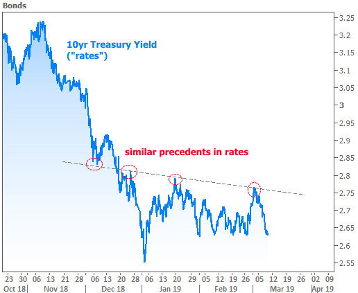
Just like there are technical ceilings, we also frequently see technical floors. To bring the discussion full circle, we could also argue that rates resisted a bigger move lower after the jobs report because it would have meant breaking below such a floor.
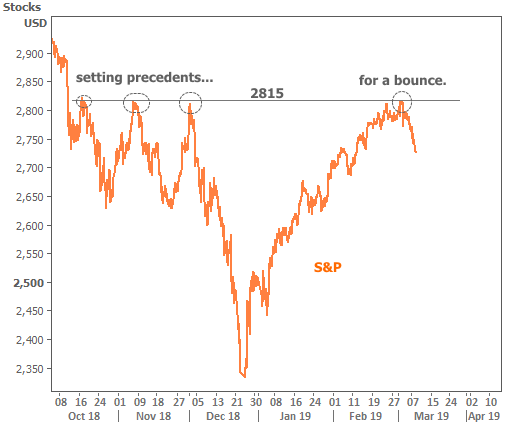
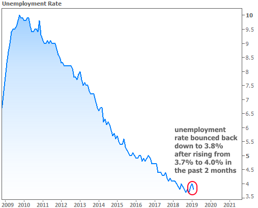
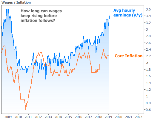
Despite the evidence for technical resistance, not everyone will be satisfied with that explanation. In their defense, it really is a lot to ask to believe chart patterns caused rates to ignore such a huge drop in the jobs count. For those left with raised eyebrows, consider the internal components of the jobs report. Not only did the unemployment rate fall back to 3.8%, but wage growth rose to another post-crisis high. Inflation may not be a huge concern at the moment, but investors will increasingly have to ask themselves how much higher wages can go without inflation eventually being pulled higher (higher inflation puts upward pressure on rates).
We won’t get any more central bank bombshells in the week ahead, but that’s only because the Fed is in a communications blackout in advance of its next big policy announcement in the following week. We will, however, get another round of fairly important economic data, and we’ve been looking toward this mid-March time frame for investors to become more willing to react to the data after taking things with a grain of salt surrounding the government shutdown. Bottom line: rate volatility could just be getting started.
Sign up for the newsletter here:
http://housingnewsletters.com/marketupdates/5c82cf7636cb281128a11561
© 2019 MBS Live, Inc. 19701 Bethel Church Rd Suite 103-225 – Cornelius, NC 28031. All rights reserved.
Related Posts